0 Comments
Explain who your character is and how they play into the story.
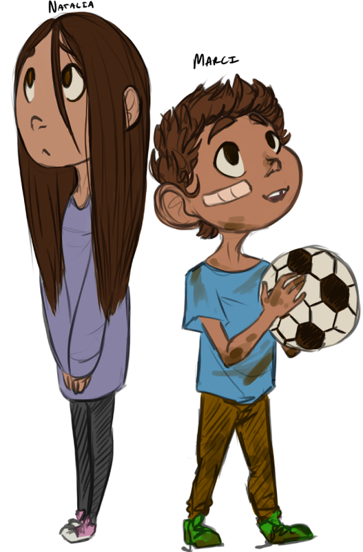
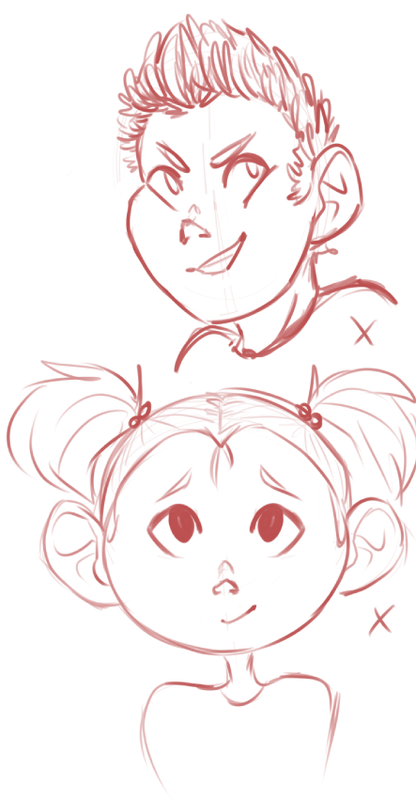
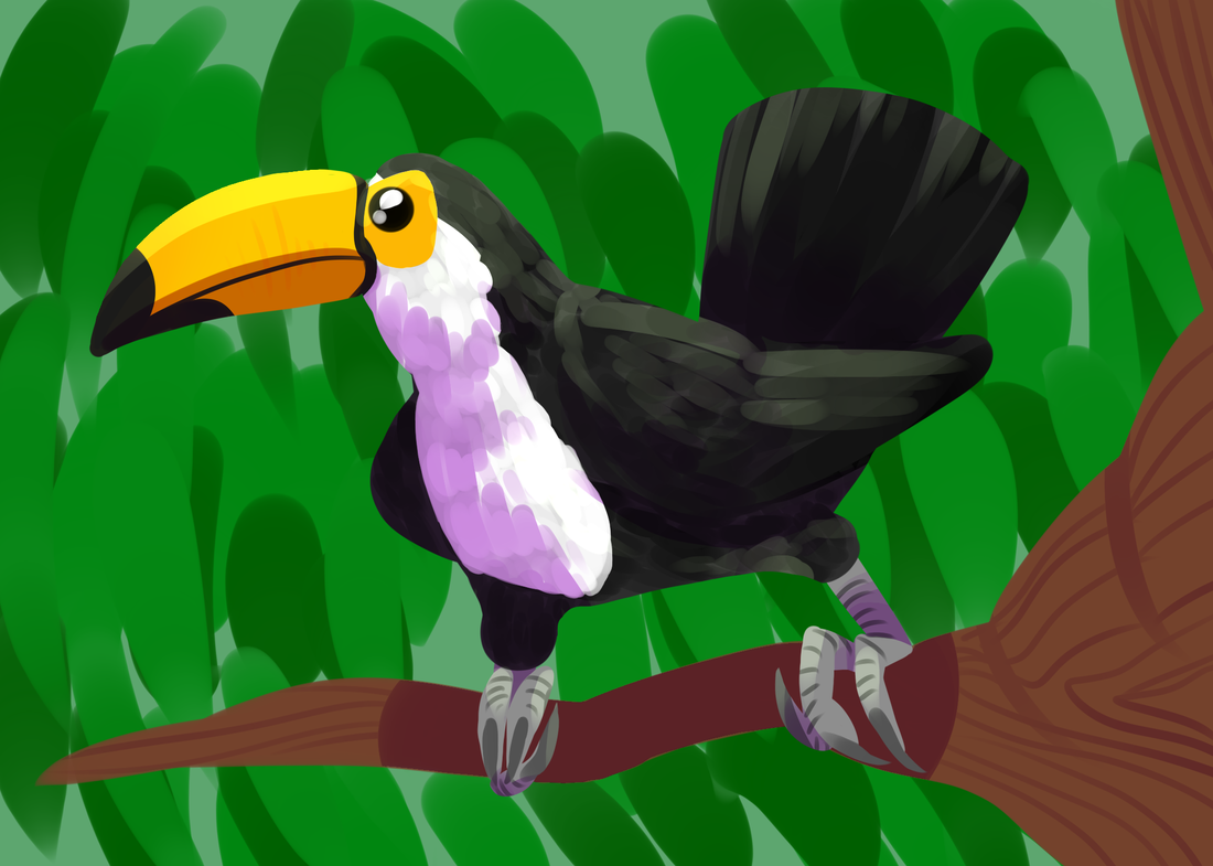
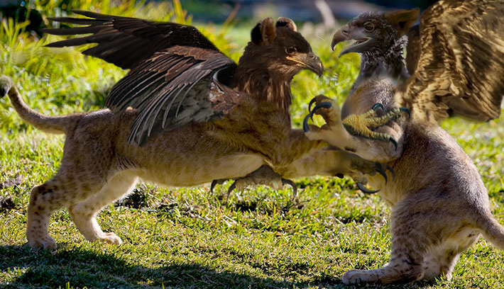
My characters are Natalia and Marci, two young siblings that are next door neighbors to Norman. Natalia, the older sister, is the only one who talks to her little brother besides Norman anymore though, since he's a ghost now. (He was sadly killed by running after his soccer ball in the street without seeing the oncoming car.) A rather sad story, but its alright because with Norman's odd gift for contacting the paranormal and his help, Natalia is able to still have fun with her brother. Explain your process to make this character. I started out sketching up young kids, since the movie has older pre-teens, teenagers, and adults, but not as many very young children. I was debating upon a reckless ghost kid who played pranks on people, the first design to the right, but decided against it when I drew the face for Marci. I also was only planning on making one character, but when I doodled Natalia and saw how their personalities opposed yet complimented one another, I decided to put them together. After that, I based their proportions on the movie, as I did their faces (or tried to), and planned their clothing according to their personalities. Marci is athletic and spunky and full of energy, so he was a little dirty, missing a tooth, and wearing vivid colors. Natalia is more reserved, a book worm probably, the voice of reason between the two of them, so she got more muted, soft colors and clothes that looked comfy. What things do you find successful and what might you change for next time? I think the designs of the characters were rather successful and their stories meshed well into the Paranorman world. I wish I had done a better job at capturing the art style of the movie, though. I still see too much of my personal style through my designs and sketches. Though I did my best to take influence, I think a few touch-ups and details could go a long way into making them look more like how the Paranorman art does. Title of the movie: Paranorman Production company: Lyca How was the stop motion completed? 3D Color Printing Who were the main people working on the stop motion of the movie? Give a short bio to at least 1 of those people. Sam Fell, a British born voice actor, animator, director, and screenwriter, co-directed Paranorman for Laika. Before this, he had a long history in film and production with many animated projects. He wrote and directed everything from movies to shorts to television shows. Chris Butler, the other co-director, is an English screenwriter and director who has worked on multiple 3D Stopmotion films other than Paranorman. He has also worked on Coraline and The Corpse Bride. What is special about the movie? Paranorman is the first stop-motion film to use a 3D colored printer to create characters and only the second movie to be shot in 3D. Insert (not a link) a video of a behind the scenes clip. (See Below) What draws you to this movie? What do you find interesting about the movie? I really liked the theme of this movie and what I had seen from previews when it was being put into theaters back in 2012, and when this project came up this was the first movie I thought of. The storyline was fun, the characters were expressive and broke a few boundaries, and I really liked how the villain was portrayed.
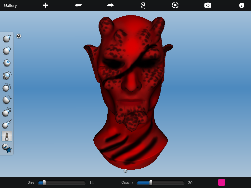
The first day everyone practiced digital painting, though I did mine on my laptop instead of on an iPad. The second we played around with 3D sculpting, where I started off trying to make a sci-fi fantasy villain but it ended up looking a bit devilish instead.

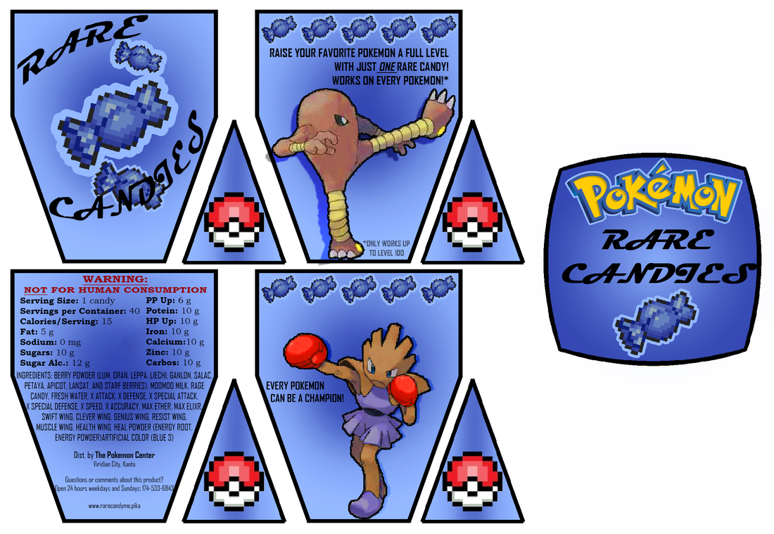
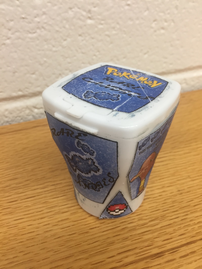
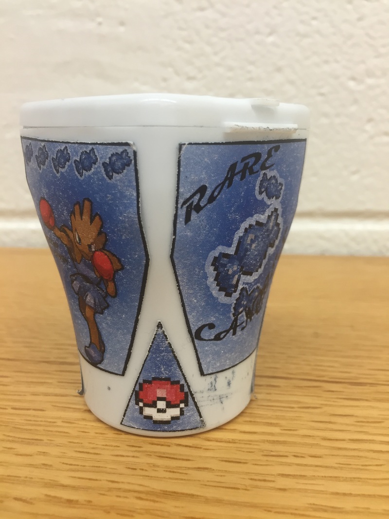
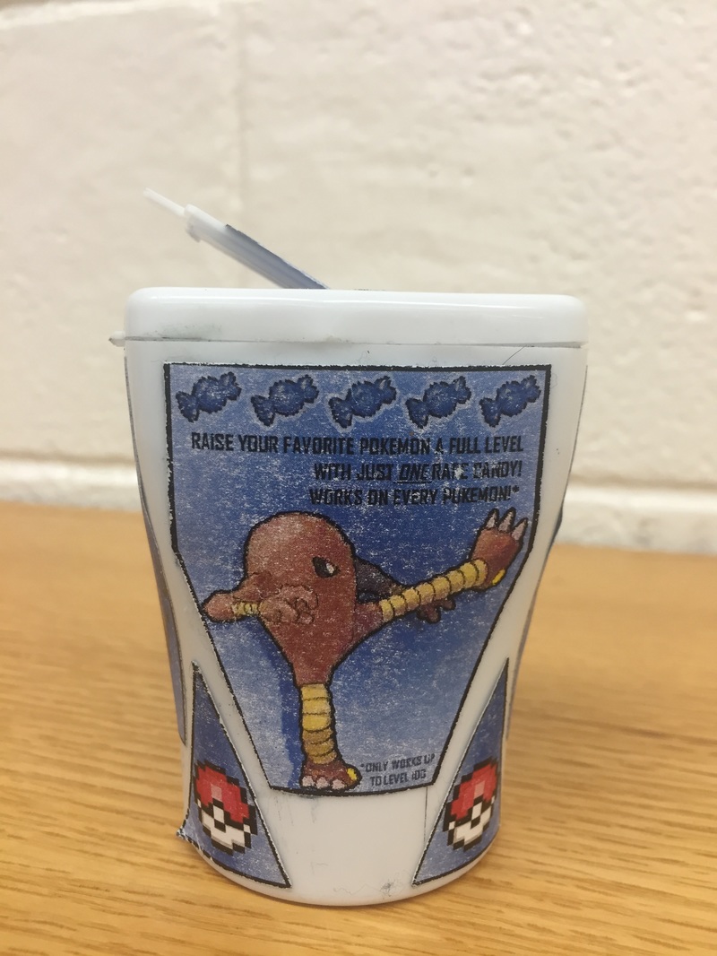
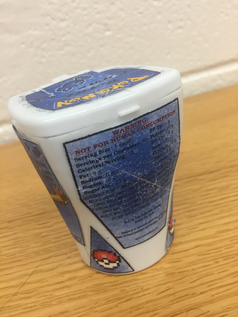
1: Why did you pick the product you did? I picked this product because I thought it would be a really fun idea. Because of how many items can be found in the Pokemon games, I was able to fill the ingredients list with actual items that can be found in the games. I was also trying to find something that was related to candy, since I had a gum container, and I think this was a rather nice fit. 2: How did you design your piece? Tell me your process. First I started with measuring the faces of the box, since it's a rather odd shape, before transferring that shape onto the computer in uniform outlines to color inside. Then I based my color scheme off the candies themselves and used pixel art of the candies from the games in the design, creating a little candy border around the two side panels. I spent a good long while on the nutrition facts and ingredients list, which took a whole lot of googling and researching, and then decided what pokemon should go onto the box like how dog treats have actual dogs on the box. I went with fighting pokemon to play off the purpose of the candies, which it to make pokemon stronger and level up. I had extra space that I didn't quite know what to do with on the little triangle bits on the sides, but eventually just decided to put pixel pokeballs on them to fit the flow but not only use the rare candy pixel sprite. Finally, I did the top of the box with the pokemon logo and one more pixel sprite. 3: What is most successful about your design? I think the most successful part of my design is the reaction I get from people when I showed them. Everyone recognized what it was right at once and they got excited at the subject matter, which made it a success in my book. It reads very obviously as to what it is supposed to be from almost every single angle. 4: If you could change anything about the piece, what would you do and why? If I could go back and redo anything, I think I would instead make the stickers just slightly bigger. They leave a little too much blank space to my liking. Or, that being said, I could go back and paint the plastic to make it look like that was on purpose instead. As for design issues or problems, I really don't have any. Maybe the font is a little squished, but there's not much I can do about that. It's a small box, after all.
|